Editorial storefront direction
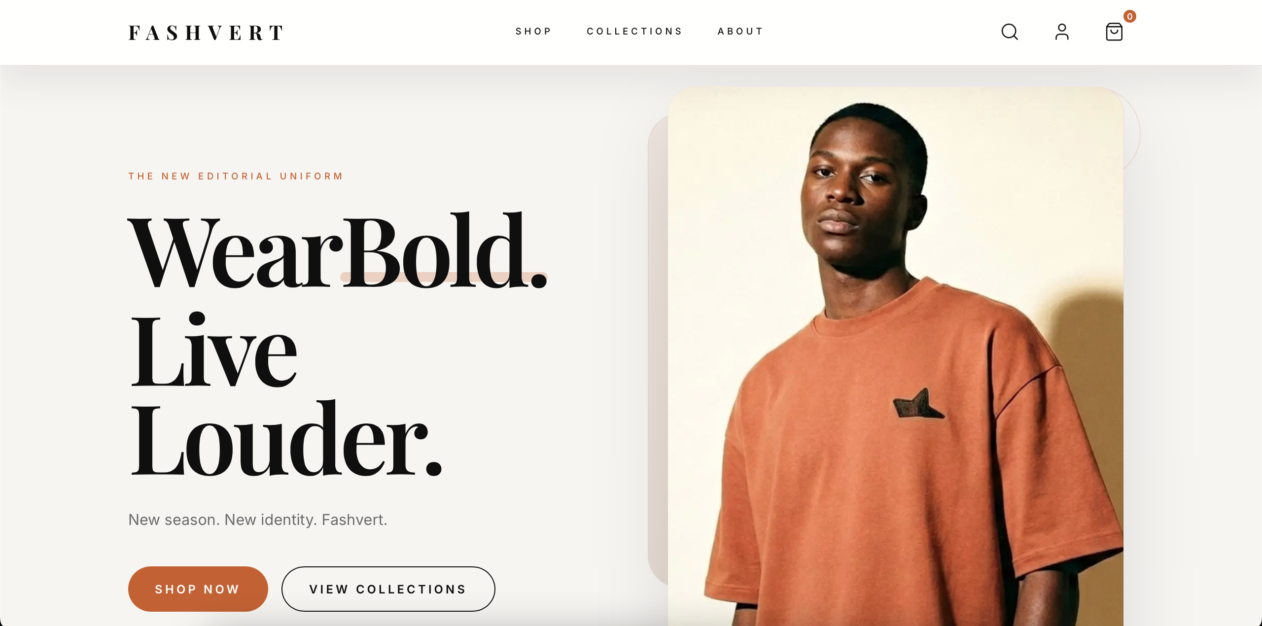
The experience was shaped around strong headlines, curated sections, and bold visual pacing so the storefront felt intentional rather than template-driven.
A fashion ecommerce showcase that demonstrates how a premium storefront can balance brand mood, merchandising clarity, and a clean shopping flow.
FASHVERT was built as a concept project to demonstrate a stronger point of view on fashion ecommerce presentation.
The goal was to show how a storefront can feel editorial and premium without becoming harder to shop.
This project mattered because ecommerce work is often judged on product grids alone, when the stronger test is whether brand, browsing, and purchase intent can coexist well.
The solution had to be practical, usable, and aligned with the real business pressure behind the project.
The experience was shaped around strong headlines, curated sections, and bold visual pacing so the storefront felt intentional rather than template-driven.
Shop, collection, and category flows were organized to make browsing feel light and confident while still supporting real shopping intent.
Next.js, Sanity, Zustand, and Supabase were combined to support flexible content updates, responsive cart behavior, and room for broader ecommerce features.
A stronger outcome comes from a stronger process, not from improvising the whole thing in code.
Defined the ecommerce qualities worth showcasing: atmosphere, hierarchy, clarity, and momentum.
Mapped the journey from first impression to collection browsing to cart-facing actions.
Structured product and collection content so the storefront could support ongoing merchandising without rigid page edits.
Implemented the concept in Next.js with Tailwind, Zustand-driven client state, and connected backend services.
Reviewed responsiveness, browsing rhythm, and product-scanning clarity across key pages and devices.
Positioned the final result as proof of capability in premium ecommerce design and engineering.
Where exact numbers were not available or public, the case study uses directional outcomes grounded in the product and business context.
The concept shows a clearer brand point of view than a generic catalog layout.
Products, collections, and supporting brand sections work together as one shopping narrative.
The project gives a visible example of ecommerce thinking across both UX and implementation.
The point was to demonstrate how fashion ecommerce can feel premium without collapsing into noise.
A showcase project still had to prove real usability, not just attractive screens.
Sanity and the supporting architecture were chosen to show how the concept could grow into a fuller commerce product.
We build ecommerce experiences that show stronger taste, clearer structure, and cleaner product thinking.
If this project feels close to what you need, these pages show how the same thinking applies to specific industries, locations, and operational problems.